
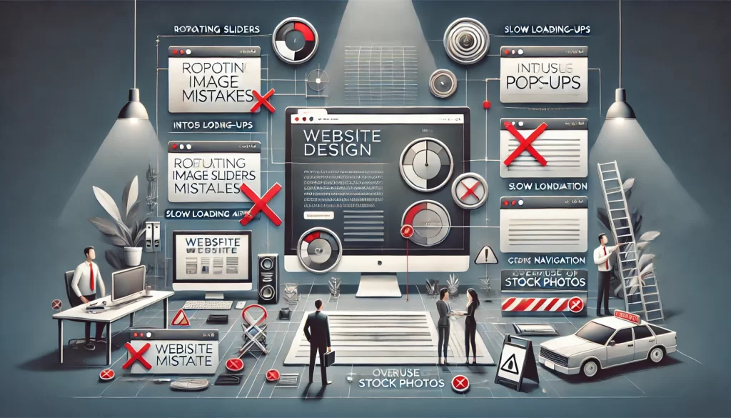
Top 10 Do-Nots in Business Website Design
Web Design Mistakes. In the digital age, your website is often the first point of contact between your business and potential customers. It’s more than just a digital storefront—it’s a crucial component of your brand identity, marketing strategy, and customer service. Creating an effective business website requires a thoughtful approach that balances aesthetics, functionality, and user experience. However, many businesses fall into common traps that can undermine the effectiveness of their site, driving users away or creating a frustrating experience that ultimately impacts your bottom line.
Avoiding these pitfalls is essential to ensuring that your website not only attracts visitors but also engages them and converts them into loyal customers. Whether it’s overloading your homepage with flashy rotating images or neglecting mobile optimization, these mistakes can cost you credibility and business. In this article, we’ll explore the top 10 mistakes to avoid when designing a business website, offering insights and strategies to help you create a site that is both visually appealing and highly functional. By steering clear of these common errors, you can enhance user experience, improve search engine rankings, and ultimately drive better business outcomes. Here are the top 10 things you should avoid when designing a business website.

1. Avoid Rotating Images in the Header: Keep It Focused and Impactful
Our first in the series of web design mistakes is, rotating image headers, also known as carousels or sliders, might seem like a visually appealing way to showcase multiple pieces of content, but they often do more harm than good when it comes to user experience. Most visitors don’t have the patience to sit through a series of rotating images, especially when they’re looking for specific information quickly. As each slide rotates, critical content can be easily missed, leading to frustration and potentially causing visitors to leave your site.
Furthermore, sliders can slow down page load times, which negatively impacts user experience and search engine rankings. In an age where speed is essential, anything that delays access to your content can be a significant drawback. Instead of relying on rotating images, opt for a static, high-quality image or video that immediately communicates your brand’s core message. This approach ensures that the most important information is visible at all times, allowing visitors to engage with your content without distraction.
A static header also provides an opportunity to highlight a clear call-to-action (CTA) right from the start. Whether it’s an invitation to explore your products, sign up for a newsletter, or contact your team, a well-designed, static header keeps the focus on what matters most—your brand and your value proposition. This direct approach is more likely to capture and retain user attention, leading to better engagement and conversion rates.
In summary, while rotating image headers might seem dynamic, they often undermine the effectiveness of your website by distracting users and slowing down load times. A static, impactful header that clearly conveys your brand’s message is a far more effective way to engage visitors and encourage them to take the next step on your site.
2. Don’t Overwhelm with Pop-Ups: Prioritize User Experience
Pop-ups can be a powerful tool for capturing leads, promoting offers, or encouraging sign-ups, but when overused, they can quickly become a nuisance, driving users away from your website. The key to using pop-ups effectively is balance—ensuring they add value without overwhelming or annoying your visitors. Too many pop-ups, or those that appear too early, can lead to frustration, increased bounce rates, and a negative user experience.
To avoid overwhelming your audience, limit the number of pop-ups on your site and ensure they are relevant to the user’s experience. A well-timed, carefully crafted pop-up that offers something of value—such as a discount, a downloadable resource, or a newsletter sign-up—can enhance user engagement. However, timing is crucial. Bombarding visitors with a pop-up the moment they land on your site can be intrusive and off-putting. Instead, consider triggering pop-ups based on user behavior, such as scrolling a certain percentage down the page, spending a specific amount of time on the site, or attempting to exit the page.
Additionally, make sure your pop-ups are easy to close. Users should always feel in control of their browsing experience, and a pop-up that is difficult to dismiss can create frustration. A clear and accessible “close” button is essential, and it’s important to avoid tricks like making the button hard to find or delaying its appearance.
In conclusion, while pop-ups can be a valuable addition to your website’s lead generation strategy, they must be used thoughtfully and sparingly. By prioritizing the user experience—using well-timed, relevant, and easily dismissible pop-ups—you can capture leads and promote offers without alienating your audience. This approach ensures that your pop-ups enhance, rather than detract from, the overall experience on your site.
3. Don’t Ignore Clear Call-to-Actions: Guide Your Visitors Effectively
One of the most common web design mistakes is the failure to implement clear and compelling calls-to-action (CTAs). CTAs are the driving force behind user engagement, guiding visitors toward the actions you want them to take, such as making a purchase, signing up for a newsletter, or contacting your team. Without well-placed and easily identifiable CTAs, even the most beautifully designed website can fall short in converting visitors into customers.
Effective CTAs should be prominently displayed, using action-oriented language that clearly communicates what the user should do next. Phrases like “Get Started,” “Sign Up Now,” or “Contact Us Today” are straightforward and encourage immediate action. Additionally, CTAs should stand out visually—using contrasting colors, larger fonts, or buttons—to draw the user’s attention without overwhelming the overall design.
Another key aspect is the strategic placement of CTAs. Avoid hiding them at the bottom of the page or in cluttered sections where they might be overlooked. Instead, place them in logical spots where users naturally expect them, such as at the end of a blog post, near the top of your homepage, or next to product descriptions. Ensuring that CTAs are easy to find helps guide users smoothly through their journey on your site, reducing frustration and increasing the likelihood of conversion.
Moreover, the language used in CTAs should be specific and aligned with the desired outcome. Vague phrases like “Learn More” or “Click Here” may not be as effective as those that clearly indicate the benefit or next step. Tailoring CTAs to the context of the page—such as “Download Your Free Guide” on a resource page or “Book Your Free Consultation” on a services page—makes them more relevant and persuasive.
In summary, ignoring the importance of clear CTAs can lead to missed opportunities and lower conversion rates. By making your CTAs prominent, concise, and strategically placed, you create a user-friendly experience that drives engagement and helps achieve your business goals. Whether it’s encouraging a purchase, capturing a lead, or prompting a user to learn more, effective CTAs are crucial for turning website visitors into satisfied customers.
4. Don’t Use Auto-Play Videos or Audio: Respect User Experience and Load Times
Auto-playing videos or music on your website can be more disruptive than engaging, often catching users off guard and creating an unwelcome experience. For visitors in quiet environments—such as workplaces, libraries, or late at night—unexpected sound can be particularly jarring, prompting them to leave your site immediately. This not only disrupts their browsing experience but can also damage your site’s reputation and is one of the worst web design mistakes.
Moreover, auto-play media can significantly slow down your website’s loading times, particularly on mobile devices or slower internet connections. Videos and audio files require substantial bandwidth, and forcing them to load automatically can lead to frustrating delays for users trying to access your content. Slow load times are a major deterrent, as users expect websites to load quickly and efficiently. If your site takes too long to load, especially because of auto-playing media, you risk losing potential customers or clients before they even see your offerings.
Instead of forcing media on your visitors, give them the option to choose whether they want to engage with your content. Embed videos with clear play buttons, allowing users to start them when they’re ready. This approach not only respects their preferences but also improves the overall user experience by preventing unexpected disruptions. Additionally, this method conserves bandwidth and enhances site performance, as media only loads when a user actively engages with it.
Another key consideration is accessibility. Auto-play can be particularly problematic for users with disabilities, such as those relying on screen readers or individuals who are sensitive to sudden noises. Ensuring that all users have control over their experience aligns with best practices in web accessibility, making your site more inclusive and user-friendly.
In conclusion, avoiding auto-play videos or audio is essential for maintaining a positive user experience, improving site performance, and ensuring accessibility. By allowing users to control their media experience, you create a more welcoming environment that keeps visitors engaged and satisfied.
5. Avoid Poor Mobile Optimization: Catering to the Mobile Majority
In today’s digital age, mobile devices dominate web traffic, with more than half of all internet users accessing websites from smartphones and tablets. If your website isn’t optimized for mobile, you risk alienating a significant portion of your audience and will be committing one of my web design mistakes. A site that isn’t mobile-friendly can be frustrating to navigate, with text that’s too small to read, buttons that are hard to click, and images that don’t display correctly. This poor user experience often leads to high bounce rates, meaning visitors quickly leave your site, potentially costing you leads and sales.
To ensure your website provides a seamless experience across all devices, focus on creating a responsive design. A responsive website automatically adjusts its layout and content based on the screen size of the device being used. Whether a visitor is browsing on a smartphone, tablet, or desktop, your site should look and function beautifully, with easy-to-read text, intuitive navigation, and properly scaled images. This adaptability is crucial for maintaining user engagement and ensuring that all visitors, regardless of their device, have a positive experience on your site.
Mobile optimization goes beyond just adjusting the layout. It also involves optimizing loading times, as mobile users often have slower internet connections than those on desktops. Compressing images, minimizing code, and leveraging browser caching are all techniques that can help your site load quickly on mobile devices. Additionally, consider simplifying your design for mobile users—less clutter means faster load times and a more straightforward, enjoyable experience.
Touchscreen usability is another important factor in mobile optimization. Ensure that buttons and links are large enough to be easily tapped with a finger, and provide ample spacing between clickable elements to avoid accidental clicks. Implementing features like sticky navigation bars, which remain accessible as users scroll, can also enhance the mobile experience by making it easier for visitors to explore your site.
In summary, neglecting mobile optimization is a significant mistake in today’s web environment. By prioritizing a responsive design, optimizing for fast loading times, and ensuring touchscreen usability, you can create a mobile-friendly website that engages users and keeps them coming back, regardless of the device they use. With mobile traffic only continuing to grow, making your site accessible and user-friendly on all devices is not just an option—it’s a necessity.
6. Don’t Use Complex Navigation: Keep It Simple for Better User Experience
Navigation is the backbone of your website’s user experience and a bad one is one of my web design mistakes. It guides visitors to the information they seek and helps them understand the structure of your site. When navigation is overly complex, with convoluted menus or too many submenus, it can lead to confusion, frustration, and a high bounce rate as users struggle to find what they need. In the worst-case scenario, potential customers may leave your site entirely if they can’t easily navigate it, costing you valuable business opportunities.
To ensure your website is easy to navigate, simplicity is key. Start by organizing your content into clear, logical categories that are easy to understand. Use descriptive labels for your menu items—visitors should know exactly what to expect when they click on a link. For instance, instead of using vague terms like “Resources” or “More,” opt for specific labels like “Blog,” “Services,” or “Contact Us.” This clarity helps users find their way around your site without unnecessary clicks or guesswork.
Limit the number of main menu items to avoid overwhelming visitors. A good rule of thumb is to keep your primary navigation menu between five to seven items. Anything beyond that can create clutter and make it difficult for users to focus on their choices. If your website has a lot of content, consider using dropdown menus or mega menus to group related items together. However, these should be used sparingly and designed in a way that doesn’t add unnecessary complexity.
Consistency is another critical aspect of effective navigation. Ensure that your navigation menus are consistent across all pages of your website. Users should always know where to find the menu, regardless of where they are on your site. This familiarity helps users build a mental map of your site’s structure, making it easier for them to navigate.
Additionally, consider incorporating a search bar, especially if your site has a lot of content. A search function provides an alternative way for users to find what they’re looking for quickly, without having to sift through menus and submenus. Make sure the search feature is prominently displayed and functions effectively, delivering relevant results to users.
Incorporating clear visual cues can also enhance navigation. For example, using a breadcrumb trail can help users understand their current location within the site’s hierarchy, allowing them to backtrack easily. Highlighting the current page in the menu or changing the color of visited links can also guide users and improve their experience.
In conclusion, keeping your website’s navigation simple, intuitive, and consistent is crucial for creating a positive user experience. By focusing on clear labels, logical structure, and user-friendly design, you can ensure that visitors can easily find the information they need, leading to longer visits, higher engagement, and ultimately, better conversion rates.
7. Avoid Slow Loading Times: Speed Matters More Than Ever
In the fast-paced digital world the next one of my web design mistakes is website loading speed. This can make or break your user experience. Today’s internet users expect instant access to content, and even a delay of a few seconds can significantly impact their perception of your site. Slow loading times not only frustrate users but also lead to higher bounce rates—visitors leaving your site before it even fully loads. This can hurt your business by driving potential customers away and reducing the likelihood of conversions.
One of the primary causes of slow loading times is unoptimized images. Large image files can take considerable time to load, especially on mobile devices or slower internet connections. To combat this, ensure all images are compressed and appropriately sized for web use without compromising on quality. Tools like image compressors can reduce file sizes while maintaining visual appeal, helping your pages load faster.
Another effective strategy is leveraging browser caching. Browser caching stores certain elements of your website, like images, stylesheets, and scripts, on the user’s device after their first visit. This means that when they return to your site, these elements don’t need to be reloaded, significantly speeding up the experience. Configuring your server to cache files correctly can lead to noticeable improvements in load times.
Additionally, consider using a Content Delivery Network (CDN). A CDN distributes your website’s content across a network of servers located around the world. When a user visits your site, the CDN serves the content from the server closest to their location, reducing the distance data needs to travel and, therefore, decreasing loading times. This is particularly beneficial for websites with a global audience, ensuring fast load times no matter where users are located.
Moreover, reducing the number of HTTP requests your site makes can also improve load times. Every element on a page—images, scripts, stylesheets—requires an HTTP request. By minimizing these requests through techniques like combining CSS files, reducing script usage, or simplifying design, you can make your website more efficient.
Finally, regular performance testing is crucial. Use tools like Google PageSpeed Insights or GTmetrix to analyze your site’s loading speed and identify areas for improvement. These tools offer specific recommendations, such as reducing server response times, enabling compression, or optimizing images, that can guide you in enhancing your website’s performance.
In conclusion, avoiding slow loading times is essential for providing a positive user experience and retaining visitors. By optimizing images, leveraging browser caching, using a CDN, minimizing HTTP requests, and regularly testing performance, you can ensure your website loads quickly and efficiently, keeping users engaged and satisfied.
8. Don’t Neglect SEO: The Key to Online Visibility
A visually stunning website serves little purpose if it remains hidden in the vast expanse of the internet this is why its one of my web design mistakes to neglect the SEO. Search Engine Optimization (SEO) is the bridge between your website and potential visitors, making it essential to integrate SEO best practices into your design and content strategy. Without proper SEO, your website is like a beautifully designed store with no signs, located on a backstreet—no one will know it’s there.
To start, your website’s content should be keyword-optimized. This means identifying the terms and phrases your target audience is searching for and naturally incorporating them into your site’s content. However, avoid keyword stuffing—search engines are sophisticated enough to detect this and may penalize your site, reducing its ranking. Instead, focus on creating high-quality, relevant content that satisfies user intent.
Proper heading structures (H1, H2, H3, etc.) are another critical aspect of SEO. These not only help search engines understand the hierarchy of your content but also improve readability for users. The H1 tag should be reserved for your main title, while H2s and H3s should organize subsections of your content, making it easier for both search engines and visitors to navigate.
Meta descriptions and title tags are also crucial. Although they don’t directly influence search engine rankings, they play a significant role in click-through rates. A well-crafted meta description gives users a clear, concise summary of your page’s content, enticing them to click on your link in search results. Similarly, an optimized title tag should include your primary keyword and provide a compelling reason for users to visit your site.
Images, while often overlooked, are another vital component of SEO. Search engines cannot “see” images, so using alt text (alternative text) to describe them helps search engines understand what the images depict. This not only improves your SEO but also enhances accessibility for users with visual impairments who rely on screen readers.
Additionally, ensuring your website is mobile-friendly is non-negotiable. With the majority of users accessing the web via mobile devices, Google and other search engines prioritize mobile-optimized sites in their rankings. This involves responsive design, fast loading times, and a user-friendly interface across all devices.
Finally, consider the importance of backlinks—links from other reputable websites to your own. Backlinks signal to search engines that your site is trustworthy and authoritative, which can boost your rankings. Building a strong backlink profile requires quality content that others find valuable enough to link to.
In summary, neglecting SEO is one of the biggest mistakes you can make in web design. By incorporating SEO best practices—such as keyword optimization, proper heading structures, meta descriptions, alt text, and mobile optimization—you enhance your website’s visibility, drive organic traffic, and ultimately, achieve your business goals. Remember, a well-optimized website is more likely to appear in search engine results, attracting the audience you’ve worked so hard to reach.
9. Avoid Outdated Design Elements
In today’s fast-evolving digital landscape, using outdated design elements can seriously undermine your website’s credibility and effectiveness and is one of my web design mistakes. Features like Flash, which was once a popular tool for adding multimedia content to websites, are now not only obsolete but can also make your website appear old-fashioned and unprofessional. Modern browsers no longer support Flash, and it poses significant security risks, making it a relic of a bygone era that can alienate users and harm your site’s performance.
Beyond technical obsolescence, outdated design elements can also create a poor user experience. For example, the use of bulky, slow-loading graphics, overly complex navigation menus, or cluttered layouts can frustrate visitors, leading to higher bounce rates and lost business opportunities. Websites that haven’t been updated to reflect current design standards may suffer from longer load times, which is a critical factor as users increasingly expect pages to load within seconds. A slow, cumbersome site can be a major deterrent, pushing potential customers toward competitors with faster, more user-friendly interfaces.
Modern web design emphasizes simplicity, functionality, and a user-centric approach. Clean, minimalistic designs with intuitive navigation, mobile responsiveness, and fast load times are not just trends—they are essential features of a website that meets the expectations of today’s internet users. Incorporating contemporary design elements, such as responsive layouts, high-quality visuals, and streamlined content, ensures that your site remains engaging and accessible across all devices, from desktops to smartphones.
Furthermore, staying current with design trends helps your brand stay relevant and appealing to your target audience. Design is a reflection of your brand’s identity, and an outdated website can send the wrong message, suggesting that your business is behind the times or neglectful of user experience. In contrast, a modern, well-designed website conveys professionalism, trustworthiness, and a commitment to quality—key factors that influence consumer decisions.
Regularly updating your website’s design not only improves aesthetics but also allows you to integrate new technologies and functionalities that enhance the user experience. This might include incorporating video backgrounds, interactive features, or the latest advancements in e-commerce design if relevant to your business. Keeping your website fresh and up-to-date ensures that it remains a powerful tool for attracting and retaining customers in an increasingly competitive online marketplace.
In conclusion, avoiding outdated design elements is crucial for maintaining a professional, user-friendly, and visually appealing website. By embracing modern design practices and regularly refreshing your site’s appearance and functionality, you can create a dynamic online presence that effectively communicates your brand’s value and keeps visitors coming back.
10. Avoid Overuse of Stock Photos
While stock photos are convenient and readily available, over-reliance on them can make your website feel impersonal, generic, and even outdated. Stock photos, especially those that are widely used across many websites, fail to capture the unique essence of your brand and can diminish the authenticity of your message. When visitors encounter the same images on multiple sites, it can lead to a lack of trust and connection with your brand, making your site blend into the crowd rather than standing out.
Original photography, on the other hand, offers a powerful way to communicate your brand’s story, showcase your products, and introduce your team. High-quality, custom images reflect the true character of your business and help build a more personal connection with your audience. Whether it’s behind-the-scenes shots of your team at work, product close-ups, or images of your office or storefront, these visuals resonate more strongly with visitors because they offer a glimpse into the real people and places behind the brand.
If you do need to use stock images, select them carefully because it’s one of my web design mistakes. Opt for high-quality photos that align closely with your brand’s aesthetic and message. Customize them where possible—such as by incorporating your brand colors or overlaying text—to make them feel more unique to your site. Additionally, avoid clichés and overly posed images that might feel inauthentic. The goal is to ensure that every visual element on your website enhances your brand narrative, rather than detracting from it.
Authentic visuals not only engage visitors but also build trust and credibility. In a digital landscape where consumers are increasingly savvy and skeptical, genuine imagery can differentiate your brand and contribute to a more memorable and impactful user experience. By prioritizing original photography and carefully curated images, you can make your website a true reflection of your brand’s identity and values, leading to stronger connections with your audience and, ultimately, better business outcomes and less web design mistakes.